Frustrating doors
March 13, 2017
Imagine you are walking towards the door in the photo below. When you reach it, do you think you should push, or pull to open the door?
Not sure? I’m sure we’ve all encountered a door like this at some point, with a handle that looks like you should pull it, except you actually need to give it the old push. It’s not our fault as the ‘user’ that we have struggled with the door, awkwardly pulling only to find we should be pushing - the design of the door has failed to communicate how we should interact with it.
There is, in fact, a name given to these kinds of ambiguous, poorly designed doors - they are called Norman Doors. These doors are named after Don Norman, an expert in design and cognitive science, who wrote about such poorly designed doors in his book The Design of Everyday Things. That book, first published in 1988, is today considered something of a canonical work on design because it explores the principles of functionality and usability. To Norman, these doors are a prime example of the importance of considered and thoughtful design. Today, it is quite common for designers to refer to any ambiguously designed thing as a Norman Door.
The web has its fair share of these so-called Norman Doors. Websites that are hard to navigate because you don’t know where the navigation is. Buttons that don’t look like buttons.
As a designer, it is always my goal to improve the experience people have using my products - I want their interaction with my website to be productive and unobstructive. So it is important that my work has a design process that seeks to stop such ’Norman Door’ situations from popping up.
Norman advocates a design process that focuses on the people who use the products we are designing, utilising principles of interaction to improve the experience. This approach to design has come to be known as User Experience design, though Norman himself prefers to call this Human Centred Design, where the focus of the designer is on how people will interact with the product, and the ways in which the product can engage those people in a productive interaction. In The Design of Everyday Things, Norman sets out some principles that can help designers to build products that are usable and accessible.
When considering the usability of something, Norman says there are two aspects which influence how functional something is - discoverability and understanding.
Discoverability
The ability to discover what operations I can perform as a user is a vital quality of a usable product. It might seem obvious, but being able to understand what something can do, and how to do it, is the magic that maketh a well designed thing. People need to be able to answer the question, “What can I do with this thing?”, and this is what discoverability is all about.
Design is really an act of communication, which means having a deep understanding of the person with whom the designer is communicating.
The discoverability of something is manifested in the interaction between the user and the designed thing. But what are the specific factors that determine how ‘discoverable’ the functionality of your product is? Norman breaks it down into five principles which we can use to guide our designs: Affordances, Signifiers, Constraints, Mapping, and Feedback.
1. Affordances
Define what actions are possible.
This refers to the physical capabilities of the designed thing. For example, a door can open, and that is an affordance which has been planned in the design.

Affordances in web design are the functionality built into the website by the designers and developers. In the example above, this mobile menu (an example of the ‘off-canvas navigation’ pattern) opens thanks to the affordances implemented on the website. It might seem obvious, but these affordances are the foundation of usability.
2. Signifiers
Specify how people discover these possibilities.
These are elements which communicate where the action should take place. For example, a handle on a door is a visual signifier that the door can be opened.
Call to action buttons are a common example of a signifier - they are a visual signifier which tries to grab the user’s attention and get them to interact. These kinds of signifiers need to be obvious, and should communicate their intended purpose.
3. Constraints
Restrict possible actions and ease interpretation.
For example, a push plate on a door doesn’t allow people to pull on the door, establishing a constraint that will stop people from incorrectly using the door.

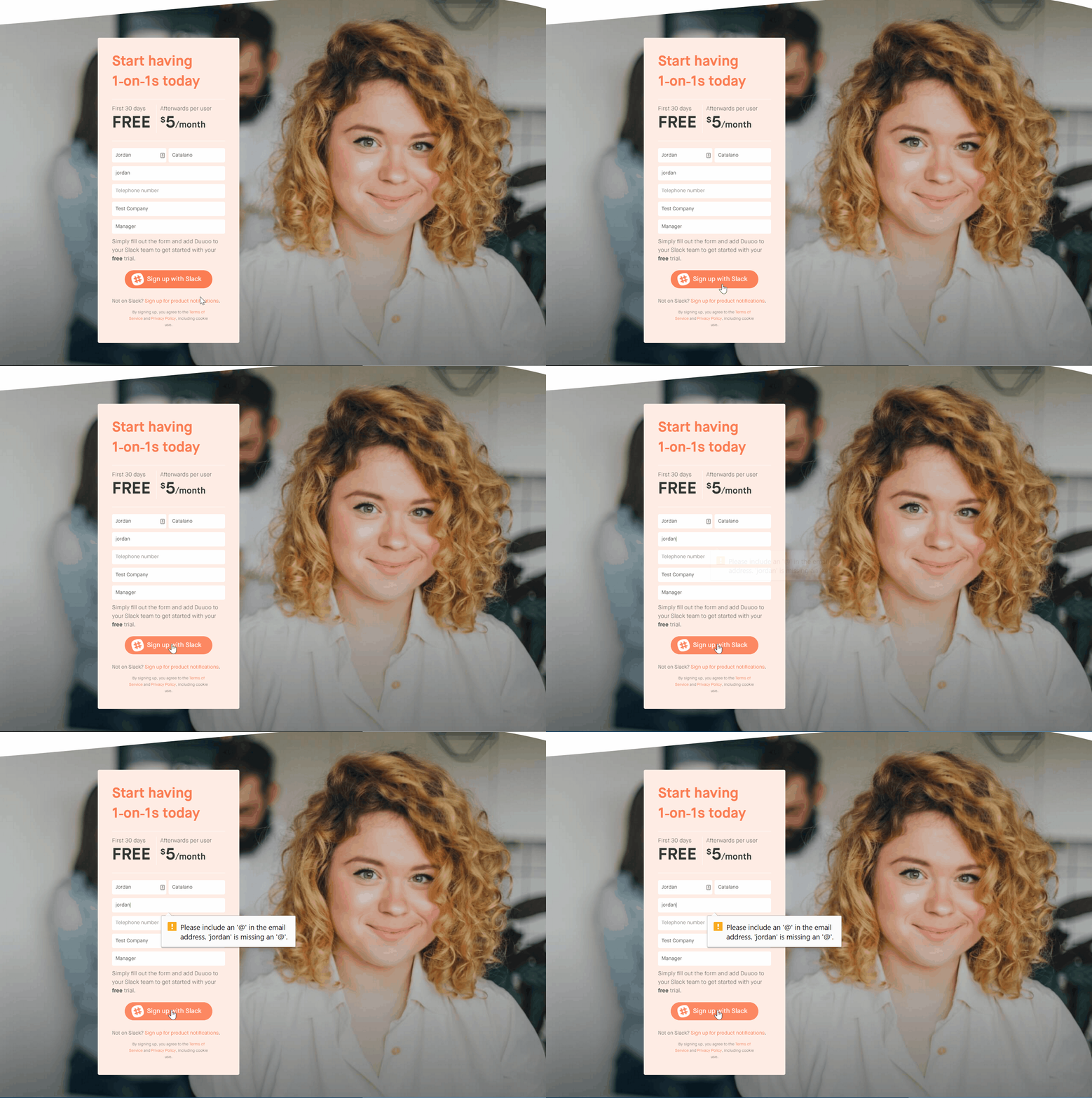
By placing limits on what the user can do, you can guide their interaction and avoid confusion. An example of this in web design is error handling, where forms will give helpful feedback to the user to avoid unproductive exchanges (for example, if the user forgets to put their name in a support request form). The example in the image above shows a form that doesn’t allow users to submit a form with incorrectly formatted emails.
4. Mapping
Establish the relationship between elements.
An example for this is the mapping of light switches that specifies which switch controls which light.

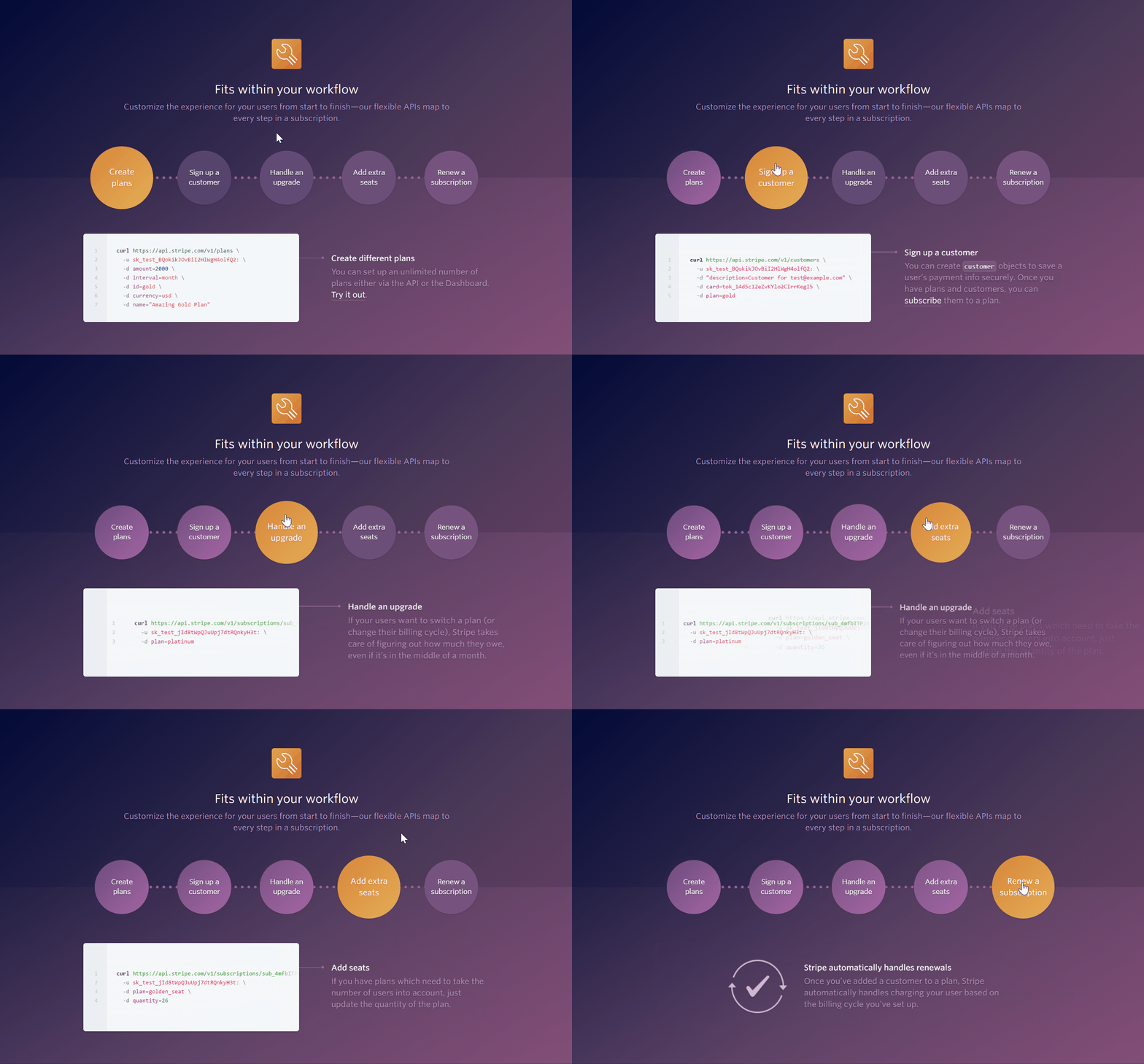
In web design, it is important to establish how elements are related to one another, and to enforce consistent patterns of interaction. This will help the user to understand the intent and purpose of elements, allowing them to navigate the site without frustration. In the example above, the designer has done a great job of establishing the relationship between the tabs and the tab content, using animation to communicate the way the tabs are controlled.
5. Feedback
Communicate the result of an action.
Elements which let the user know how an action was received. They allow users to interpret the outcome of their actions.

Feedback plays a very important role on the web, letting users know how their actions have been received. In this example, Twitter has implemented a fun little animation to indicate the ‘like’ action has been successful.
Understanding
Besides discoverability, the other half of the usability equation that Norman talks about is the concept of understanding. Users who interact with your design will come to build a conceptual model of how the thing acts, based on the processes outlined under discoverability.
It is the goal of human centered design to have your users understand your website, and to avoid the frustration that results from confusion. By aligning the users’ expectations with their experience, you can ensure that people will be able to use your website or product in a way which feels easy and productive.
Implementing Human Centred Design principles
At Internetrix, our internal design processes are built around human centred design principles, and we try to implement Norman’s principles in all our projects. The following practices are just some of the processes to put in place to promote human centered design:
- User Testing - By allowing people to test and deliver feedback, you can gain valuable insight on the usability of your product before you send it out in the wild.
- Iterative Design - Another of Norman’s insights, it is important to refine and revisit your design as user feedback and other new data brings to light areas for improvement.
- Accessibility - With the web, it is important to provide a great experience to all of your users, and as such it is vital that you take care to implement designs which are accessible and consider a wide spectrum of people.
- Progressive Enhancement - The capabilities of devices and browsers moves fast, so making sure to deliver a functional experience to users is important.
By carefully considering your users and their experience, you can avoid the kinds of frustrating experiences that badly designed doors so famously cause. By focusing on these factors of discoverability in your website or product, you take a step in the direction of happy and frustration-free customers, which can then lead to a happy and frustration-free you.

